by Simon Andrews
Gerrit Rietveld’s iconic armchair belongs to a brief yet explosively creative chapter in his development as an architect and designer, capturing the intellectual and artistic tumult of a world now in change. A pivotal object in the history of modern furniture design, Rietveld’s chair was first published in De Stijl magazine, autumn 1919. His revolutionary composition delineated structure as geometric planes, and celebrated the void as a substitute for massing. With this design, Rietveld crucially engineered the dematerialisation of familiar typologies, forging an aesthetic language of modernism in which the primary intellectual message is one of concept, and of reductive yet essential purposefulness.
Taking inspiration both from Russian Suprematism and from European Cubism, the Dutch De Stijl collective was founded in 1917, with Rietveld joining in 1919. The group advocated for a streamlined abstraction that was guided by graphic use of line, plane and colour. The ambient, deconstructed imagery of the painters Theo van Doesberg, Bart van Der Leck, and Piet Mondrian, amongst others, found material synergy with Rietveld’s own experimental abstractions of furniture. Collectively, the pioneering momentum of De Stijl’s creative expression — active across all media from furniture to architecture and typography — now announced the urgency of a new era.
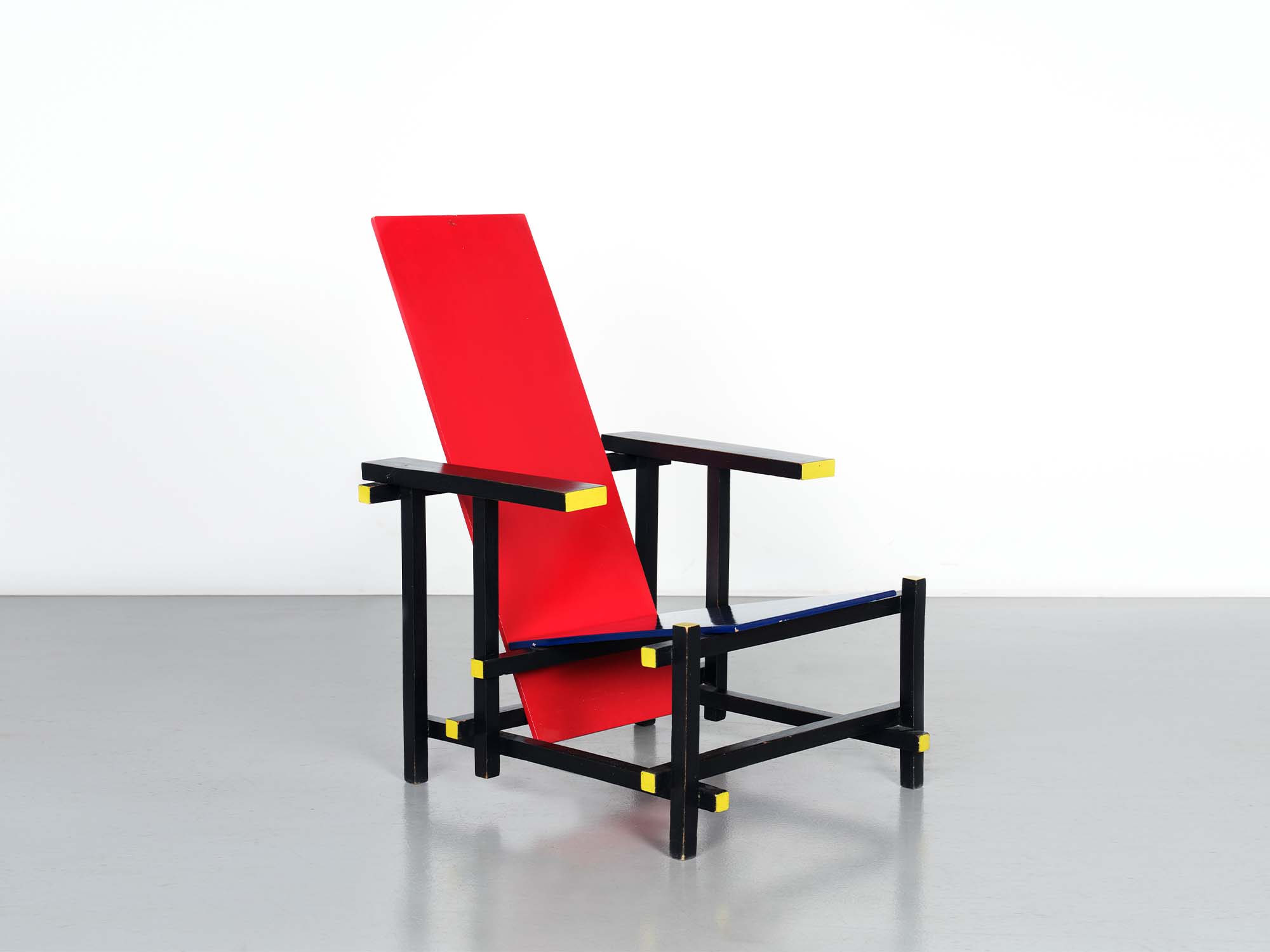
The chair published in De Stijl of 1919 was the earliest example of the form, and featured angled side panels beneath the armrests. The unpainted surfaces appear to be lightly stained, or waxed. Around 1920-21 Rietveld removed the side panels, made the first of several adjustments to the dimensions of the billets, and began to experiment with monochrome stained or painted finishes applied overall to the structure — initially white, grey, black or red, some of which were accented with colours to the tips of the billets.
The earliest documented examples to feature any combination of the iconic De Stijl primary colours of red, blue and yellow (alongside the non-colours of black, white and grey) were produced around 1923-24, although Rietveld had previously experimented with this spectrum on items of children’s furniture first in 1919, and then in 1921.
Significantly, this now established direct association with the abstract paintings in primary colours by the De Stijl artists Piet Mondrian and Bart van Der Leck, dissolving any distinction between art and industry. Revealingly, Rietveld described these painted components not as ‘planks’ but rather as ‘planes’, underlining the capacity for colour to isolate abstraction and to encourage the de-materialisation of structure. Whereas the monochrome palette that had characterised earlier versions of the chair had been selected to compliment specific interior schemes or client requirements, Rietveld’s decision to now engage with these bold primary colours had an immediate and sophisticated effect — establishing an object that augured independence of presence with the assuredness of a manifesto.
Rietveld described his creations as ‘abstract, realistic sculptures for our future interiors’ (quoted from Reyer Kras, Gerrit Thomas Rietveld 1888-1964, Barry Friedman Ltd, New York, 1988). Despite this assertion, contemporary reports of the first public appearance, in May 1924, of the as-yet untitled ‘Red-Blue Chair’ remained sparse and surprisingly neutral. Primarily this was due to the limited dissemination of information beyond the immediate circle of De Stijl participants, and the over-reliance in subsequent publications upon the single grainy monochrome image of the chair that had been first published in De Stijl in 1919. Remarkably, the first colour image of what was to eventually be known as be a ‘Red-Blue Chair’ was not published until 1954. This publication was pursuant to MoMA’s ‘De Stijl’ exhibition of 1952-53, which had travelled to the US, by way of Venice, from the pioneering Stedelijk Museum’s retrospective of 1951. The post-war period provided crucial and fertile terrain for overdue review of the entire De Stijl movement, including Rietveld’s essential contribution. Between 1950-51 the Stedelijk acquired twelve Rietveld furniture designs, ten of which were purchased directly from the designer. In 1958, on the occasion of Rietveld’s 70th birthday and in his home town, the Centraal Museum Utrecht assembled the most complete retrospective of the designer’s work, establishing firm context and lineage of his prolific creativity. Up to this point, the chair had remained untitled, and although internal inventory lists from the MoMA and Venice exhibitions made perfunctory reference to ‘red-blue chairs’, it was not until the 1958 Centraal Museum retrospective that Rietveld himself began to describe his creation as the ‘Red-Blue Chair’. The assertion of an icon was now assured.
In the instances where the original provenance has been preserved, examples of chairs that combined primary colours or red, blue and yellow were revealingly acquired by those friends and colleagues closest to Rietveld’s milieu, traversing the progressive avant-garde of the era. This included those engaged with architecture (J.J.P. Oud, Truus Schröder-Schräder), painters and sculptors (Roelph Jongman, Douwe van Der Zweep, Jacob Bendien, Lode Sengers), and also an example that belonged to the Dutch ophthalmologist Gezenius ten Doesschate. This latter example had passed via Rietveld’s and Philip Johnson’s guidance to be acquired by MoMA in 1953. It was this example that was the first to be photographed and printed in colour, in 1954. The present chair was acquired around the first half of the 1920s by the Utrecht-based sculptor Steph Uiterwaal (1889-1960) and was dispersed, alongside other Rietveld designs from the family estate, by Uiterwaal’s heirs in 1987.
Research undertaken by Marijke Kuper in 2012 records a total of nine early chairs — all distinguished by having employed either in whole or in part a combination of the definitive De Stijl primary palette of red, blue and yellow — that are today preserved in international museum collections. Of these, eight feature a combination of all three primary colours. The example held by the Brooklyn Museum is an exception, and features seat and back that are both painted red and enhanced by frame terminals painted yellow.
In 1953 MoMA New York had been the first institution to acquire an example of a primary colour ‘Red-Blue Chair’. Alfred H. Barr Jr., MoMA’s first director had long advocated the significance of the form, having previously in 1936 included an example loaned from Alexander Calder (now unfortunately lost) for his exhibition ‘Cubism and Modern Art’.
Subsequently, primary-colour painted examples were acquired by the Stedlijk Museum, Amsterdam (1962); The Brooklyn Museum (1971); The Vitra Design Museum, Weil-am-Rhein (1987); The Centraal Museum, Utrecht (1988); The Osaka City Museum of Art (1992); The High Museum of Art, Atlanta (2002), The Museum of Fine Arts, Houston (2013), and the Utsonomiya Museum of Art, Japan. Nine further examples in either stained, varnished or otherwise painted in non-primary colours further support museum collections.
Excluding the present example, according to Kuper two further primary-colour painted chairs are retained in private collections — one in the US (since 1986) and the other in Europe (since 1996). Kuper’s reference also identifies two further examples previously in existence however currently recorded as location unknown, bringing the total of extant surviving examples of Rietveld’s iconic primary-colour painted chairs, including the present example, to fourteen.
Detailed physical examination of the present chair reveals that the components, construction and palette intentions remain consistent with other examples executed around the first half of the 1920s. Chairs executed before 1925 were made by Rietveld himself assisted by three technicians, one of whom was Gerard van de Groenekan who in 1925 assumed control of workshop production, with Rietveld himself now too busy with architectural projects. Restored by van de Groenekan in 1970, these subsequent interventions to the present chair appear to be primarily concerned with the re-securing of joints and structural contact points, together with enhancement of the palette.
The earliest examples of the form utilised solid timber boards for the seat and back however this proved to be too susceptible to warping and cracking. Consequently, by the early 1920s these were efficiently substituted by boards of laminated wood. The present example retains original matching laminated wood boards to both seat and back, distinctively notched to the underside to provide anchor upon the frame before originally being secured by nails. Although laminated wood ensured that the profile of the boards remained stable, the connecting points to the frame ultimately lacked durability and would eventually be substituted by screws and metal clips as now illustrated.
Close examination of the paint layers to the back board confirms the existence of an initial, original layer of red pigment applied directly to timber, characteristically laid without use of a primer coat. Analysis also suggests the presence of a similar red pigment to the seat board, then possibly an older layer of blue, all now lying beneath the final current blue finish applied by van de Groenekan in 1970. Although now bearing more than one generation of paint, the yellow pigment applied to the terminals of the black-stained frame also appears to have been originally applied directly onto unprimed wood at the time of original execution. This evidence determines that the present chair, acquired by Steph Uiterwaal around the first half of the 1920s and enhanced by van de Groenekan in 1970, was always conceived by Rietveld as an example to feature primary colours. The likely predominance of red to both boards at the time of original creation invokes direct comparison with the only other example to illustrate this specific palette — that being the example acquired by the Brooklyn Museum in 1971 having originally belonged to the celebrated De Stijl architect J.J.P. Oud.