By Sarah Archer
Archetypes of American design are the subject of the Italian studio’s first gallery exhibition in the United States.
There are numerous human markers to consider in the context of a domestic setting: gender, age, culture, geography, and style among them. Think through each one, and you might envision spaces personalized with various mementos, or a particular color palette, depending on the demographics of its primary inhabitant.
But if asked to sketch a typical living room with limited instructions, many of us would start with a rectilinear sofa and some chairs, then add a coffee table, a television set, and perhaps a pair of lamps on a set of end tables. Art over the sofa, small decorative objects, and books might complete the scene.
These sketches—like the drawings of people who have attempted to re-create a map of the United States from memory—are apt to be a little wonky, but they will likely share a certain organizing principle and key ingredients all in a particular proportion that might be easier to envision than to describe. Why is this? And where does this collective imaginary interior come from?
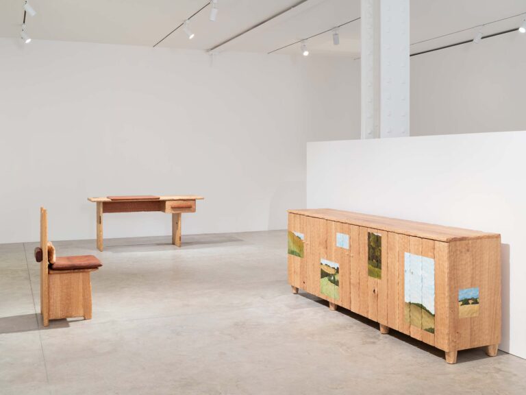
For their inaugural U.S. gallery exhibition, “Formation” (June 6–August 1), at Friedman Benda in New York, Andrea Trimarchi and Simone Farresin of the Milan-based studio Formafantasma decided to explore the contours of this mystery, training their analytical and aesthetic powers on archetypes of American design. If it’s true that we share a collective unconsciousness where design tropes are concerned, it might be fair to say that Trimarchi and Farresin want to interpret the symbols in our dreams. But not just interpret—also strip them down, rotate them in space, consider their materials, and arrive at a sense of what these objects mean both in their native contexts (a Frank Lloyd Wright dining room, say) and in the abstract gallery space where “Formation” takes shape.
Why archetypes? A Renaissance word in English with Greek roots, an archetype is the first of something, the original model from which subsequent versions are made. Etymologically, it’s arkhein, “first,” followed by typos, “model” or “the mark of a blow.” (Typography is a close relative.) Archetype also has a second, more recent meaning: Thanks to the work of psychiatrist Carl Jung (1875–1961), who established the school of analytical psychology, an archetype is a figure or a phenomenon that can exist in our shared understanding of the world through its appearance in myths, dreams, and cultural practices, such as a mother figure, a child, or a flood after which everything has changed. Archetypes, in other words, are not necessarily ours to reject or accept; indeed they shape our world and our understanding of it.
In planning “Formation,” Trimarchi and Farresin kept returning the fact that this would be Formafantasma’s first gallery exhibition in the United States. “For us, it was impossible not to think about American design,” Farresin says. They settled on three designers—or, more specifically, one highly influential utopian religious community and two individuals—as formal and conceptual inspiration for their new body of work: the Shakers, Frank Lloyd Wright, and the furniture-maker George Nakashima. How must the work of the industrious and austere Shakers, who are celibate and live communally, seem to two designers from Italy? Far from being puzzled by the singularly focused lifestyle of a group of ultrareligious Americans, Farresin sees them as products of their historical context: “Who wasn’t part of a religious community at this time?”
And as for the oft-cited observation that everything the Shakers designed was informed by their beliefs and ideology, Farresin turns the question back on us: What’s surprising is the assumption that all the objects that surround us in our daily lives don’t embody our beliefs. The objects with which we share our lives may not be physical archetypes precisely hammered out to copy an original design, but rather archetypes in the Jungian sense: the ideas, assumptions, and beliefs that shape our whole world and consciousness.
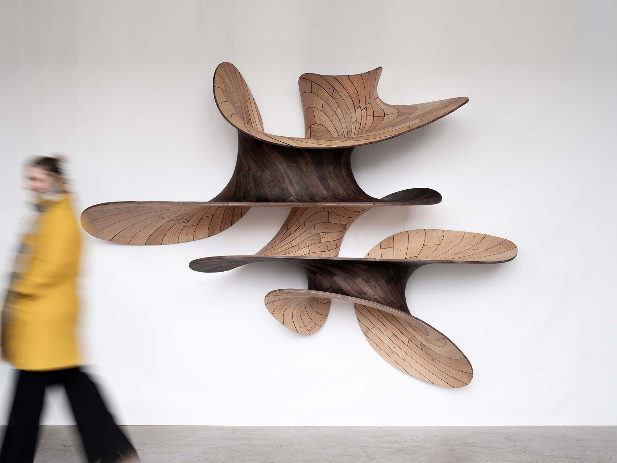
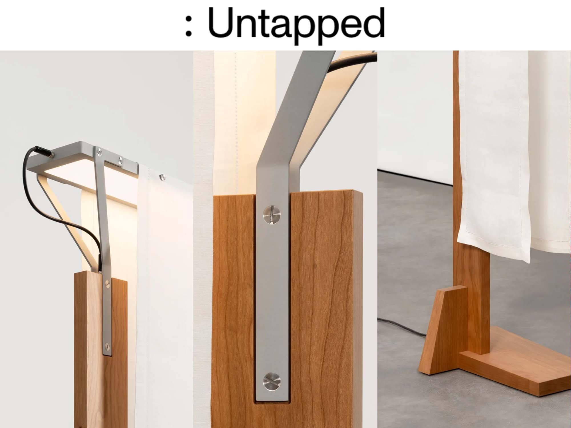
Trimarchi and Farresin found common elements—cherrywood and the elemental form of the plank—in the work of the Shakers, Wright, and Nakashima. Wood’s ability to record nature’s comings and goings has long held special meaning for the pair. In 2020, they presented a new body of work in an exhibition called “Cambio” at London’s Serpentine North Gallery; the pieces made from a single tree that had been felled in northern Italy by a storm in 2018, making the objects a kind of collective record of climate change (cambio is Italian for “change”). In “Formation,” they designed an armchair with a rounded, sculptural form and sumptuous blue velvet upholstery. Here, a formal echo of Wright’s aesthetic is evident, if subtle: The back of the chair is long and rectilinear, recalling the elongated height, but not the overall form, of one of Wright’s dining chairs.
Embedded in this gesture is a desire for timelessness, which in turn can be read as a critique of the mass marketplace. A sense of individuality in the form of an unusual proportion or a signature angle can become the mark of a design’s authorship. Authorship rewards the continual generation of new objects to meet demand, and objects proliferate, ironically furnishing the world with objects that echo one another in a desire for distinctiveness.
One way to stanch this flow is through subtle gestures of individuality. “When you rely on the proportion of an archetype [that] is positive,” says Farresin, “it generally makes the object more long-lasting and it’s not as easy for it to go out of fashion. In terms of sustainability, that’s positive.” And in this respect, as much as Wright, Formafantasma pays homage to the unique works of Nakashima, who tended to build pieces of furniture around the contours of an individual plank of wood—flaws, surprises, and all.
While planks provide the formal language of the furniture in this exhibition, the lighting is designed with a particular rectangular form in mind—one so pervasive that a 21st-century human might not recognize it as an archetype at all. “In thinking about the archetype of light in our domestic space, Andrea and I realized that the most iconic lighting is not one of the lamps, but that of the laptop. It’s a panel of light,” Farresin says, noting that in the show, “there is a lamp in which the light at the top is basically the proportion of the iPhone.”
If you’re reading this now, there’s a good chance you’re doing so on a device with these very proportions. But walking into the gallery to see “Formation,” you might not readily identify the rectangular glow atop the lamps as having the shape of a digital gadget. After all, Wright’s high-backed dining chairs and Nakashima’s long dining tables also traffic in rectangles, and they may have echoed the rectangular forms of their own age: factory windows, railcars, conveyor belts, or even office desks.
That’s what happens when a really thoughtful design touches on archetypes new and old. When, even without having seen something before, you can’t help but find meaning in it.