By Caitriona Devery
Jonathan Trayte is a British artist living in London. He makes uncanny sculptures that work with everyday references. One common thread is food, from the alluring fruit and vegetable shapes that pop up throughout his collections, to the visual language of global consumer food packaging that he borrows from and manipulates. He works with a variety of materials, often marrying natural forms with artificial colours and shiny finishes.
Jonathan spent the first five years of his life living between Yorkshire and Nelspruit, South Africa. Art loomed large around him. “My parents travelled a lot in that time. All the while, everywhere we went we’d come across exquisite, hand carved artworks in soap stone or hard wood, laid out on blankets for tourists to buy. I spent the rest of my childhood in Yorkshire, a stone’s throw from the Sculpture Park where we’d go all the time and climb on the Henry Moores”.
Food was a source of pleasure and interest from an early age. “I’d always cooked for my siblings. During my undergraduate studies in Canterbury, I took a job at the Good’s Shed farmers’ market and restaurant to keep me going and pay the bills. I started off selling vegetables in the market and then ended up in the kitchen for three years where I learnt more about materials and making than at college. Discovering new consistencies and textures, and learning about how things react to hot or cold, or how the quality of something behaves on your tongue. There are so many similarities that cross over to sculpture, like sugar and glass or flour and plaster.”
“I am really intrigued by that fine line – and I think it is a fine line – between something that is appetising but then suddenly nauseating.” — Jonathan Trayte
It’s no surprise then, that his work has a distinctly edible quality. Trayte’s visceral sculptures celebrate the weirdness and beauty of nature and draw attention to the deceptive, slightly monstrous nature of the modern food and advertising industries. In this increasingly information-rich world we are saturated with sensory and cognitive stimulation, and ongoing tension between desire for novelty and excitement on one hand, and the dizzying, overwhelming sensation of too much on the other. I asked Jonathan if he was interested in teasing out that borderline between desire and revulsion?
“Absolutely, I am really intrigued by that fine line – and I think it is a fine line – between something that is appetising but then suddenly nauseating. A friend of mine told me a story about a famous burger chain that approached a top designer, a very well respected one whose name I can’t remember. They paid him a lot of money to design the seating for all of their restaurants and he immediately passed the forming of the chairs and the way that you sit in them to some younger, less experienced designers.
The client was really upset about this, but he said no, what you’re paying me for is to design the colour. And he chose a colour that has a very specific effect on the brain, it’s a colour that is both appetising when you are hungry and instantly nauseating once you were satiated. A peculiar shade of orange”.
It sounds like a clever interior design trick, a colour that prompts diners to get out of the restaurant as quickly as possible after they’ve eaten. Jonathan explains further.
“The psychology of colour comes into it, how your appetite behaves. It also has a lot to do with the huge glass windows that are now commonplace. When on the street you see people eating and are draw in, appetite piqued. But no one likes to be seen eating and will finish and leave hurriedly, leaving vacant seats and completing the loop”.
“The patches of fat are in a hand threaded silk which is smooth and cool to the touch in contrast to the bulky warm wool. It actually feels like you’re handling silken fat rather than the meat itself.”
“There are many levers that can be operated on our senses. For huge chain restaurants, a simple design feature might make table turnover slightly faster thus over time increasing profits.”
— Jonathan Trayte
There are many levers that can be operated on our senses. For huge chain restaurants, a simple design feature might make table turnover slightly faster thus over time increasing profits. Trayte also works with visual cues and the psychology of advertising, but in a playful and instinctive way.
“I borrow from the language of foodstuffs and food packaging because this rich vocabulary has such an intense effect on how somebody thinks or how they perceive materials or substances. I’m borrowing in a naïve kind of way, just taking things and redefining them to create my own distorted visual language.”
“I don’t have any formal training in colour theory or how colour is applied to create certain emotions or reactions, I just respond to my own interpretation of that language. It’s an appropriation, a bastardisation of what is probably quite a complicated process. I’m sure though in advertising people use these colour choices very carefully, and there is a code.”
He collects food packaging and is particularly interested in that from other cultures. “I have a huge archive from around the world. I use these scraps and wrappers for selecting colours or borrowing motifs when making artworks, even taking them to the paint shop for swatch matching. What interests me is the nuances in language between different cultures. Generally speaking, cow’s milk is cow’s milk across the world, but if you go to the States, a carton of milk might have baby pink font or dirty orange branding, whereas to a European that’s kind of alien.
To learn about these processes, Jonathan met with Professor Charles Spence at Cambridge University who is an expert on multisensory perception and consumer psychology.
“We had an hour long discussion on the subject of experimental psychology and how it’s used in industry. I was a little disappointed to discover that there is no specific guide book on the subject, no succinct chart of influences and effects. There has been a lot of research on the subject but mostly relating to actual products or brands. For example, it may seem insignificant or a very slight manipulation, but westerners drink more coffee in a darker room”.
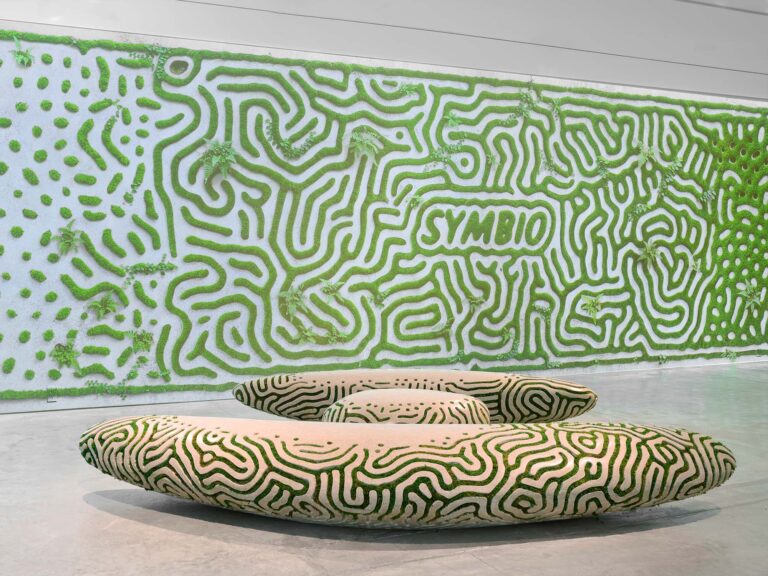
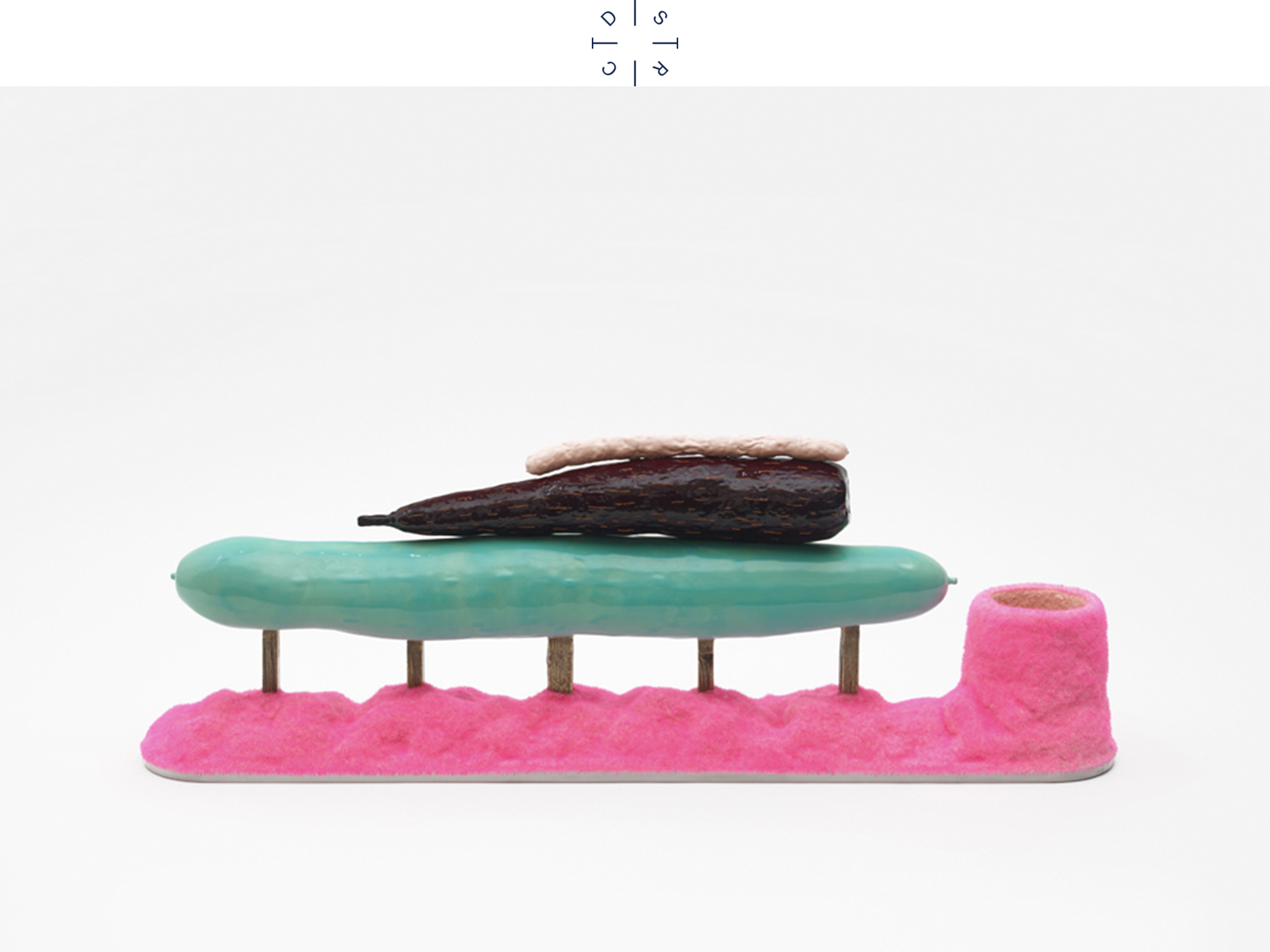
Alongside hyperreal advertising references, natural food forms recur, often with saccharine pop colours and high-gloss finishes. Alongside, there are hints of decay and dissatisfaction. His Polyculture exhibition at the Tetley in Leeds in 2016 featured huge, shiny tubular cucumber-like shapes standing erect over visitors while the ground was strewn with grey, decaying marrows. Perhaps a reflection on how our innate appetite for food is exploited by the seductive perfection of advertising while at the same time as food itself is engineered away from its messy, natural origins. Augmenting what is ‘natural’ is the basis of the food industry. Jonathan is interested in that tension.
“I’m drawn to the obscene and the ungainly, the really awkward rejects that come about through giant vegetable growing or back yard gardening. Cucumbers that have taken a right turn, huge swollen gourds with bulbous ends or misshapen, bifurcated root vegetables that have gone off in some peculiar way to avoid a rock. I also like things like really inflated synthetic looking doughnuts. Looking at how we produce and consume things from the natural world enables me to reflect on mankind as a whole. In modern western society we have this manicured idea about life, but in reality the world is full of really scary looking, weird shaped, odd smelling things. Many of the materials that I use complement each other and they’re aesthetically pleasing, but I will always include some grit in the mix because life is never perfect”.
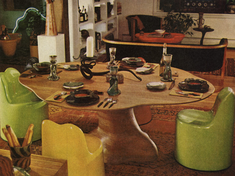
Jonathan studied sculpture and has a postgraduate degree in Fine Art from the Royal Academy Schools. While his work has primarily been within this fine art and gallery context, he has experimented with more functional making. For the 2018 show Fruiting Habits with design gallery Friedman Benda he made an entire apartment interior, filled with objects existing somewhere between furniture and food. One of these was a rug that looked like a slice of mortadella. “I just wanted to see how this iconic product would translate into silk and wool. It’s so pleasing, the patches of fat are in a hand threaded silk which is smooth and cool to the touch in contrast to the bulky warm wool. It actually feels like you’re handling silken fat rather than the meat itself”. Jonathan’s most recent work has just last year been unveiled in London. The Spectacle is a public art installation which has elements of seating, lighting and sculpture. Situated in a busy street with lots of pedestrian footfall, the pieces work collectively as a meeting place, or somewhere to pause. In his unique style, the highly stylized colours and motifs are borrowed from the language of foodstuffs and confectionary, and once again it looks good enough to eat. With your eyes if not with your mouth.